BL21DE3,
That looks a lot better, don't you agree?
I can visualise (sad, I know) your logo in the top left-hand corner now...
A couple more thoughts (you decide if they are worthwhile or not):
1) How about stripping the surround back to no more than a few pixels of the forum grey (ie forum colour) on each side
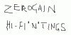
2) Zerogain is a little hard to read, but you do not want to mess with it because it is just right IMO. So why not add another line to the scrolling text, so it runs something like: Welcome to Zerogain.......Track 0: Your Handle to the Missing Groove
3) limit the animation to, say, a dozen passes
") .
.